Power Apps Custom Column Visualizations: Setup and Data Guide
Learn how to use custom column visualizations in Power Apps, configure gauges, charts, heat maps, and ratings, and prepare data correctly.
Power Apps Custom Column Visualizations: Setup and Data Guide
Working with data in Microsoft Power Apps can become much easier when you can understand information at a glance. A long list of numbers may tell you how a project is performing, but a small chart, gauge, or rating can make the same information much easier to read.
That is where Power Apps custom column visualizations come in.
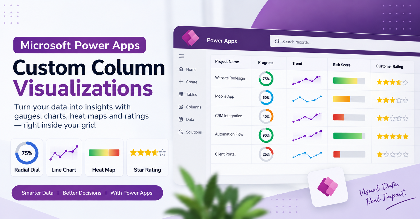
Custom column visualizations allow you to display certain column values as graphics inside a grid instead of showing only plain text. Depending on the type of data you have, you can use a radial dial, line chart, heat map, or star rating.
In this guide, we will look at what these visualizations are, how to configure them, which data formats they support, and what to check when a visualization does not display as expected.
What are custom column visualizations in Power Apps?
Custom column visualizations are a feature in Power Apps that changes how data is displayed in a column. Instead of showing a value such as 75 or 4, the grid can display that value as a gauge, trend line, colored bar, or group of stars.
The underlying data remains important. The visualization is simply a different way to present it.
For example, imagine a project tracking table with a column called Project Progress. If the column contains the value 75, a radial dial can show a gauge that is 75% full. This makes it easier to compare progress across several records.
The feature is especially useful when users need to scan a grid quickly and identify important values without opening every record.
Note: Custom column visualizations are a preview feature. Preview features may have limited functionality and are not intended to be relied on as production-ready features without appropriate testing.
Types of custom column visualizations
Power Apps provides four main visualization types for supported column data. You can also select None to return to the normal text display.
1. Radial dial
A radial dial is a circular gauge that displays a value as a percentage. The filled portion of the ring grows as the value increases, and the percentage appears in the center.
This visualization works well for:
Project completion percentage Task progress Survey completion Service-level progress Other percentage-based measurements
Example:
Suppose a project has a completion value of 60. The radial dial will show a ring filled to approximately 60%.
The radial dial expects a numeric value on a scale from 0 to 100.
Important data considerations
If your data is stored as a fraction, such as 0.6, convert it to 60 before using it as a percentage value. A value of 0.6 is interpreted as 0.6%, not 60%.
It is also best to use a numeric column and avoid adding currency symbols, units, or unnecessary text to the value.
2. Line chart
The line chart displays a small trend line, sometimes called a sparkline, inside the column. It is useful when a single record contains a series of numbers and you want to see how those values change.
For example, a sales record might contain weekly sales figures:
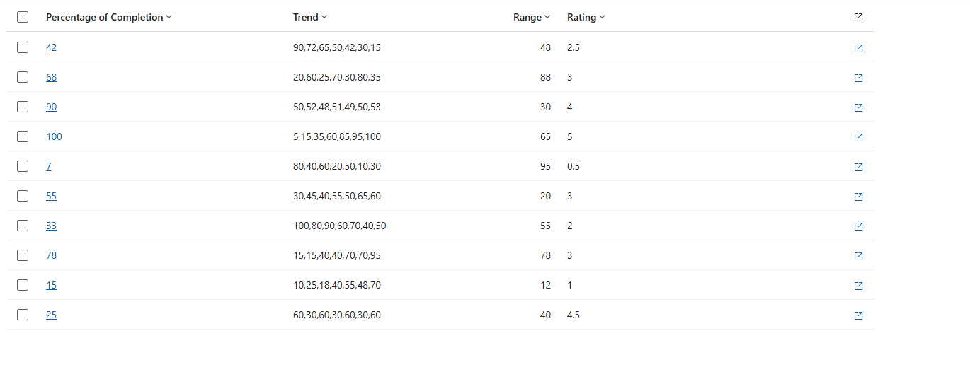
10,20,30,45
The visualization uses these numbers as points in order and draws a line across them.
When should you use a line chart?
A line chart can be helpful for:
- Weekly sales figures
- Monthly performance
- Customer activity
- Progress measurements
- Other numerical trends
Example:
A value such as 5, 8, 6, 9, 12 creates a line that rises and falls across five points.
The line chart expects a text column containing several numbers separated by commas. Spaces around the numbers are acceptable.
3. Heat map
A heat map displays a horizontal bar whose color changes according to the value. The bar helps users understand where a number falls within a range.
For example, a low value may appear in a green shade, a middle value in amber, and a high value in red, depending on the visualization's color settings.
This can be useful for:
- Risk indicators
- Performance scores
- Workload levels
- Priority measurements
- Progress comparisons
By default, the heat map uses a range from 0 to 100.
The column should contain a single numeric value. If you use a choice column, the numeric value assigned to the choice determines the position and color of the bar.
A common heat map mistake
The displayed text of a choice may look correct, but the numeric values assigned to the choices can affect the color. For example, if the choice values are not arranged in a logical low-to-high order, the colors may not match the order users expect.
Always check the numeric values behind your choices.
4. Star rating
The star rating visualization displays a row of stars. Filled stars represent the value, while the remaining stars appear empty.
By default, the display uses five stars.
This visualization is a good fit for:
- Customer satisfaction
- Service ratings
- Product evaluations
- Internal feedback scores
- Simple quality assessments
The star rating expects a whole number from 0 to 5 by default.
If your rating system uses a different maximum, such as 10, make sure the display is appropriate for your data. The default five-star display is not automatically converted into a ten-star display.
How to configure custom column visualizations in Power Apps
Once your data is ready, you can configure the visualization from the column settings.
Step 1: Open Power Apps
Sign in to Power Apps at:
Go to Solutions and open the solution containing the table you want to work with.
Step 2: Open the table
Select the table you want to edit, then open its Columns area.
You can select an existing column or create a new column, depending on your requirements.
Step 3: Find the visualization setting
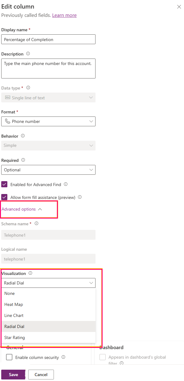
Open the column properties and expand Advanced options.
Look for the setting named:
Choose how this column's data will be visualized in the application
You should see options such as:
- None
- Heat Map
- Line Chart
- Radial Dial
- Star Rating
Choose the visualization that matches the format and meaning of your data.
Step 4: Save the column
Select Save after choosing the visualization.
When the column is displayed in a supported grid or view, its data can appear using the selected graphic instead of the standard text format.
If you do not want a graphic, select None to return to the regular text display.
Preparing your data for better results
The quality of a visualization depends on the data behind it. A graphic cannot correctly represent a value if the value is stored in an unexpected format.
Here are some practical guidelines.
Use the correct column type
Radial dials, heat maps, and star ratings work with numeric data. Line charts use a text value containing comma-separated numbers.
Choosing the correct column type helps avoid display problems.
Keep values clean
Avoid unnecessary text, currency symbols, units, and thousands separators where the visualization expects a clean number.
For example, a numeric value such as 60 is more suitable for a percentage dial than a value such as $60 or 60 points.
Stay within the expected range
Each visualization has its own expected range.
- Radial dial: 0–100
- Heat map: 0–100 by default
- Star rating: 0–5 by default
- Line chart: a comma-separated series of numbers
Values outside the expected range may be capped, flattened, or displayed unexpectedly.
Use enough points for a trend
A line chart is more useful when it contains multiple numerical points. A series such as 10,20,30,45 gives a clearer trend than a single number.
Leave missing values empty
If a record has no data, an empty cell is generally better than entering words such as none or not available. An empty value can display as an empty visualization.
Common problems and how to fix them
Sometimes a visualization does not look the way you expect. The problem is often related to the data format.
The radial dial is always full or empty
Check whether the value is outside the 0–100 range or stored as a fraction between 0 and 1.
For example, 0.6 is interpreted as 0.6%, not 60%. Convert it to the correct percentage scale before displaying it.
The line chart shows only a dot
This usually happens when the column contains only one number. Add two or more comma-separated numbers to show a trend.
The line chart contains gaps
Check the series for entries that are not numeric. Invalid entries can create gaps in the visualization.
The heat map color looks incorrect
If you are using a choice column, review the numeric values assigned to the choices. The color is based on those values, not necessarily on the order in which the choices appear in the list.
The star rating is completely filled
Check whether the value is equal to or greater than the number of stars. With the default five-star display, a value of 5 fills all five stars.
When should you use custom column visualizations?
Custom column visualizations are most useful when users need to compare information quickly inside a grid.
For example, a project management table might use a radial dial for project completion, a heat map for risk, and a star rating for customer satisfaction.
However, not every column needs a graphic. Names, descriptions, dates, and detailed notes are usually easier to understand as text.
The best approach is to use visualizations only where they make the information easier to interpret.
Final thoughts
Power Apps custom column visualizations provide a simple way to make grid data more useful and easier to scan. With radial dials, line charts, heat maps, and star ratings, you can present numerical information in a more visual format without building a separate dashboard for every use case.
The most important step is to prepare your data correctly. Once the column type, value range, and format match the visualization, the result can be much clearer for the people using your Power Apps solution.
If you are building a Power Apps or Microsoft 365 business solution and need help improving your data presentation, automation, or application workflow, the right visualization can be a small change that makes the entire experience easier to use.